.webp)
My Figma Workflow: Designing Every Page with Relume

Every project starts the same way for me: not with a blank Figma canvas, but with the client's brand. Before I ever open a component library, I need to understand who I'm designing for. Here's the process I follow, from brand identity to a fully designed page, using Relume as my structural backbone in Figma.
Step 1: Start with brand identity, not layout
Before touching Figma, I go through whatever brand material the client has: logo, color palette, typography, tone of voice, any existing brand guidelines. If they don't have a formal brand identity yet, I build a mini one first colours, fonts, and a few adjectives that describe how the brand should feel (professional but warm, bold but simple, and so on).
This step matters more than people think. A layout can be technically clean and still feel wrong if it doesn't match the brand's personality. I'd rather spend an extra hour here than redesign a page later because the type or spacing doesn't fit who the client actually is.
Step 2: Map out the page content first
Before I design anything visually, I lay out the actual content for each page headlines, body copy, CTAs, the order sections should appear in. I usually do this directly in a simple document or in Figma using plain text blocks, page by page.
Why content before layout? Because a layout designed around placeholder "Lorem ipsum" text almost always breaks once real content goes in. Headlines run longer than expected, some sections have more to say than others, and CTAs need specific, real wording to feel convincing. Designing structure around real content from day one means far fewer surprises later.
Step 3: Bring in Relume for structure
This is where Relume comes in. Instead of building every section from scratch, I use Relume's library of pre-built, WebFlow-ready sections heroes, feature grids, testimonials, pricing tables, footers as a starting structural framework in Figma.
The reason I rely on Relume isn't to skip design thinking; it's to skip reinventing structure that's already been solved well. Relume's sections are built on solid UX patterns, so I can move fast on structure and spend my actual creative energy on customization: typography, color, spacing, imagery, and how sections flow into each other. For each page, I pick sections that match the content I mapped in Step 2, drop them into Figma, and start adapting them to the brand.
Step 4: Customise until it doesn't look like a template
This is the step that separates a fast build from a generic one. Once the Relume sections are in place, I go through every section and rework it to match the brand identity from Step 1:
- Swap in the brand's actual typography and type scale
- Adjust spacing and grid rhythm to feel intentional, not default
- Replace stock imagery with real photography or custom illustration where possible
- Adjust color usage so it feels like the brand, not like "a website that uses this library"
By the end of this pass, a client (or another designer) shouldn't be able to tell the page started from a component library at all.
Step 5: Review page-to-page consistency
Once individual pages are designed, I zoom out and look at the whole site together: does the homepage hero style match the about page hero? Are buttons, spacing, and section rhythm consistent across every page? This is easy to lose track of when designing page by page, so I always do a full pass at the end comparing every page side by side in Figma before handing off to development.
Step 6: Handoff to WebFlow
Because Relume's Figma library mirrors its WebFlow component library, moving from Figma into WebFlow development is much smoother than starting from scratch. Structure, spacing, and naming conventions carry over cleanly, which saves real time once I move into build.
Why this process works for me
Using Relume doesn't replace the design thinking, it replaces the blank page. The brand and content work upfront is what actually makes each site feel custom, even though the structural bones came from a library. For client work especially, this means I can move faster without sacrificing the part that actually matters: a site that looks and feels like that brand, not like every other Relume-based site out there.
If you're a designer curious about this workflow, my advice is the same as always: don't skip the brand and content steps to get to the "fun" visual part faster. That's where the actual design work happens the library is just the scaffolding.
Related posts

WebFlow Is Now Available in ChatGPT: Here's Why It Changes Website Management
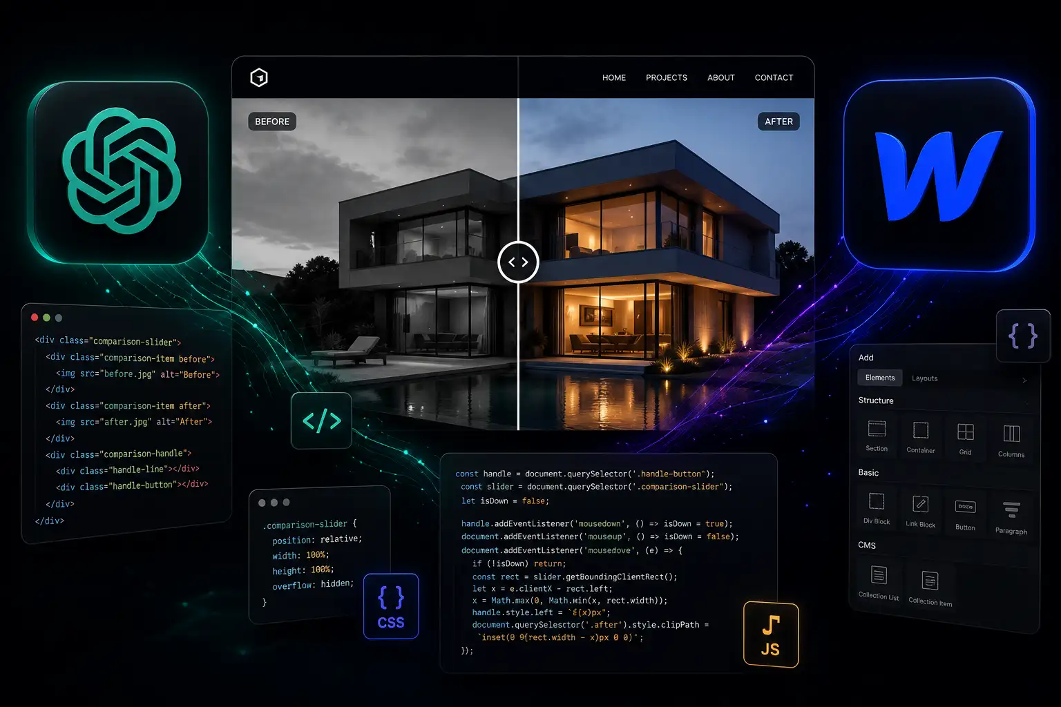
How ChatGPT Speeds Up WebFlow Development
My Figma Workflow: Designing Every Page with Relume

How I Started Using Claude to Speed Up My WebFlow Workflow