
Mobile-First in 2026: Why Your Website Should Work on Smartphones First
Mobile traffic dominates the web. Designing for smartphones first can improve usability, performance and organic visibility.
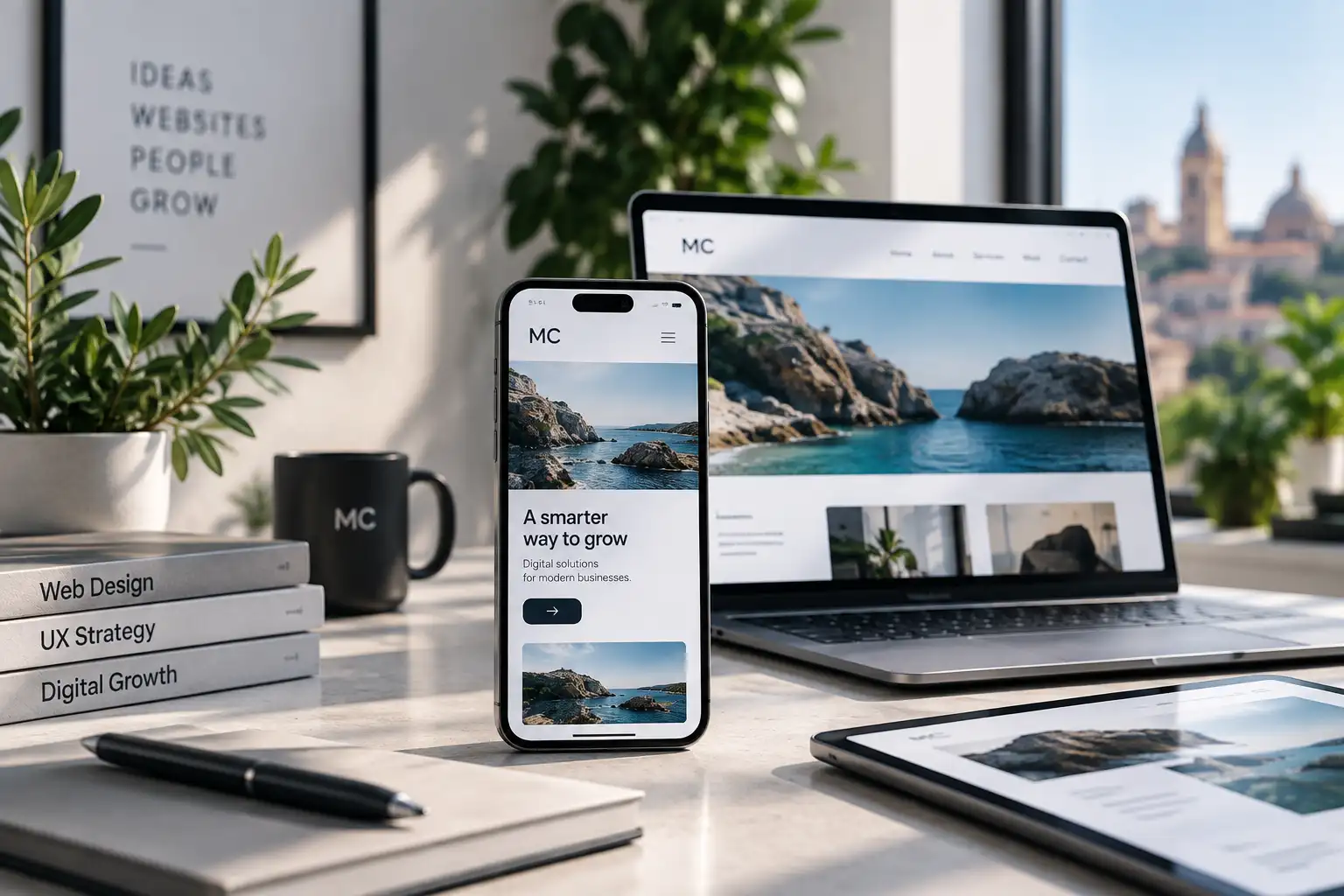
A website can no longer be designed for desktop first and adapted to smartphones at the end. In 2026, mobile is one of the main contexts in which a potential customer discovers a business, reads its services, compares alternatives and decides whether to make contact.
What mobile-first really means
Mobile-first does not simply mean shrinking a desktop page. It means starting with the essential content and actions, organising them for a small screen, touch interaction and fast navigation, then expanding the experience for tablets and desktops.
A Webflow article on designing for mobile highlights the importance of creating user-friendly experiences for small screens. The practical consequence is straightforward: complex menus, small buttons, slow pages and content that is difficult to scan can cost real opportunities.
Three priorities for a business website
First comes hierarchy: the value proposition, services and calls to action should be immediately understandable. Second is interaction: buttons, forms and navigation need to work well with fingers, not only with a mouse. Third is performance: heavy images and unnecessary effects can slow down the users who may have the least bandwidth available.
Mobile also affects organic visibility because Google uses mobile-first indexing. Important content, links, metadata and functionality should therefore be available and accessible on mobile.
The key takeaway
A good mobile website is not a reduced desktop version. It is an experience intentionally designed to help people understand, navigate and act with as little friction as possible.
For a complete mobile-first project, explore our website design and development service.
Source: summary and commentary based on Webflow, How to build user-friendly mobile websites for small screens.